2.4 Using Supplementary Elements
In section 1.1 we described the data set containing 51 cities on which 40 economic variables have been measured. Until now we have performed a couple of Principal Component Analysis using only the so-called active variables (i.e. the variables about the salaries of 12 professions). However, the data table contains additional variables that can be taken into account in order to enrich our analysis.
2.4.1 Continuous Supplementary Variables
The continuous supplementary variables can be positioned in the factorial spaces using the same formulas applied to the active variables.
Within a normalized PCA, we use the correlation of a supplementary variable \(\mathbf{x^{+}_{j}}\) with the principal components \(\boldsymbol{\psi_{\alpha}}\)
\[ \phi^{+}_{j \alpha} = cor(\mathbf{x^{+}_{j}}, \boldsymbol{\psi_{\alpha}}) \tag{2.16} \]
(the superindex + indicates that this is a supplementary variable)
With a non-normalized PCA, we just need to multiply the correlation by the standard deviation of the supplementary variable:
\[ \phi^{+}_{j \alpha} = s_j \hspace{1mm} cor(\mathbf{x^{+}_{j}}, \boldsymbol{\psi_{\alpha}}) \tag{2.17} \]
The position of the supplementary variables with respect to the factorial axes is interpreted in the same way as with the active variables.
The position of a supplementary variable in a factorial plane allows us to visualize the relationship of the variable with the set of active variables via the factorial axes.
Notice that we have not defined a distance between two supplementary variables. The relative positions between two supplementary variables does not imply any correlation between them. However, as long as the supplementary variables are well represented on the first factorial plane, and close to each other, we can expect that the similarity of their correlations with the axes (similarity of their coordinates) is a consequence of a strong correlation between them.
Visualized Regression
The position of a continuous supplementary variable in a factorial plane resembles that of a “visual regression”. From this point of view, the supplementary variable plays the role of response variable. In turn, the projection subspace (first factorial planes) play the role of explanatory variables. This analogy is depicted in figure 2.11
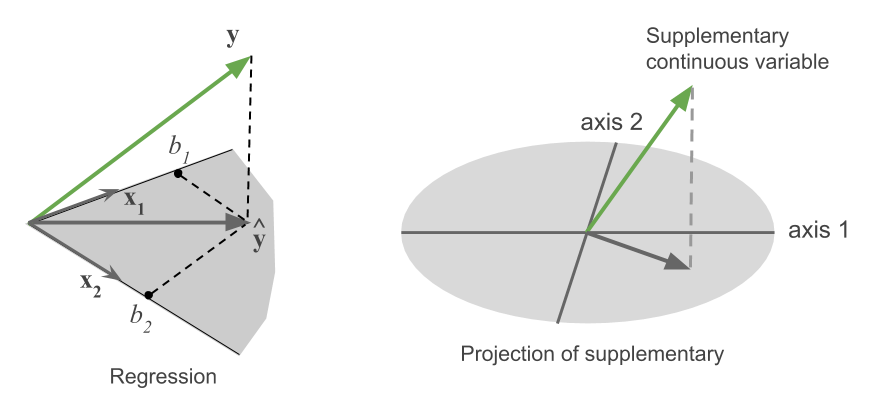
Figure 2.11: Equivalence between a regression and the projection of supplementary
In a regression, we are mostly interested in the value of the coefficients, and we care about whether the explanatory variables allows us to predict the response variable \(\mathbf{y}\).
In a PCA, there is usually a considerable number of variables of type \(\mathbf{y}\). Their projections onto the first factorial plane indicate, in a quick way, which are well (or not) related with the set of active variables. On the other hand, their positions with respect the axes provide what we call interpretation elements of the axes.
Quality of Representation for Supplementary Variables
To compute the quality of representation for the supplementary variables we calculate the squared cosines of each supplementary variable with the different factorial axes. Keep in mind that the overall sum of the squared cosines on the \(p\) axes will (in general) be less than one.
\[ COS^2 (j^{+}, \alpha) = cor^2 (\text{variable}^{+}, \text{factor}) \]
To get the location of a supplementary variable in the original space, we need to know its \(n\) elements (its values for the \(n\) individuals). This is analogous to an active variable, except that the set of active variables is found in a subset of dimension \(p\) (the rank of \(\mathbf{X}\), or the rank of \(\mathbf{X^\mathsf{T} X}\)). The coordinates on the \(p\) factorial axes allow to locate any active variable. This property is not present for supplementary variables.
It doesn’t make sense to calculate the contributions of the supplementary variables to the inertia of the axes, because these variables have not intervened in its construction.
In the second analysis of the cities, we have decided to treat the following variables as supplementary variables: the 12 active variables used in the first PCA, the rest of the 16 continuous variables, as well as the variables derived in the 2nd analysis, namely, salary_inequality and manual_qualified. In addition, we have also decided to consider the five axes obtained in the first analysis as supplementary variables; we do this to study the relationship of both PCA analyses.
| Dim.1 | Dim.2 | Dim.3 | |
|---|---|---|---|
| price_index_no_rent | -0.35 | 0.22 | -0.09 |
| price_index_with_rent | -0.31 | 0.26 | 0.05 |
| gross_salaries | -0.61 | 0.37 | 0.02 |
| net_salaries | -0.58 | 0.39 | 0.05 |
| work_hours_year | 0.46 | -0.09 | 0.18 |
| paid_vacations_year | 0.10 | 0.34 | -0.11 |
| gross_buying_power | -0.67 | 0.37 | 0.03 |
| net_buying_power | -0.62 | 0.39 | 0.07 |
| bread_kg_work_time | 0.42 | -0.28 | -0.15 |
| burger_work_time | 0.22 | -0.33 | -0.26 |
| food_expenses | -0.29 | 0.15 | -0.10 |
| shopping_basket | -0.35 | 0.21 | -0.09 |
| women_apparel | -0.13 | 0.14 | -0.05 |
| men_apparel | -0.11 | 0.21 | -0.16 |
| bed4_apt_furnished | 0.08 | 0.21 | 0.37 |
| bed3_apt_unfurnished | 0.06 | 0.08 | 0.45 |
| rent_cost | -0.28 | 0.33 | 0.30 |
| home_appliances | 0.12 | -0.15 | -0.16 |
| public_transportation | -0.58 | 0.31 | -0.12 |
| taxi | -0.49 | 0.26 | -0.12 |
| car | -0.10 | -0.13 | 0.38 |
| restaurant | -0.22 | 0.12 | 0.28 |
| hotel_night | -0.18 | 0.22 | -0.03 |
| various_services | -0.37 | 0.27 | -0.04 |
| tax_pct_gross_salary | -0.68 | 0.17 | -0.19 |
| net_hourly_salary | -0.58 | 0.38 | 0.05 |
| teacher | -0.51 | 0.50 | 0.18 |
| bus_driver | -0.56 | 0.43 | 0.14 |
| mechanic | -0.62 | 0.13 | -0.01 |
| construction_worker | -0.69 | 0.21 | -0.01 |
| metalworker | -0.63 | 0.28 | 0.21 |
| cook_chef | -0.25 | 0.37 | 0.02 |
| factory_manager | -0.04 | 0.52 | 0.16 |
| engineer | -0.25 | 0.51 | 0.11 |
| bank_clerk | -0.14 | 0.54 | -0.02 |
| executive_secretary | -0.43 | 0.45 | 0.03 |
| salesperson | -0.46 | 0.42 | -0.10 |
| textile_worker | -0.63 | 0.40 | 0.03 |
| Axis1 | -0.48 | 0.43 | 0.07 |
| Axis2 | 0.72 | 0.39 | 0.03 |
| Axis3 | 0.01 | -0.37 | -0.23 |
| Axis4 | 0.01 | -0.08 | 0.03 |
| Axis5 | -0.05 | 0.01 | 0.71 |
| salary_inequality | 0.87 | 0.07 | 0.23 |
| manual_qualified | -0.55 | -0.68 | 0.27 |
From the above table, we see that the salaries of the 12 professions, as well as most of the expenses, are negatively correlated with the first dimension. This indicates that the cities with higher salaries tend to remunerate (relatively) less the managerial professions.
Also, the correlations of variables price_index_no_rent and price_index_with_rent are a bit smaller than the correlations of gross_salaries and net_salaries. This indicates that the most expensive
cities have also a higher buying capacity, and elevated taxes and social services.
The first axis opposes cities with low salaries that pay relatively well to factory_manager, engineer and executive_secretary, to the cities with higher salaries that pay relatively better those professions that are less socially well considered. This axis can thus be labeled as a salary inequality. In fact, the derived variable salary_inequality is the most correlated to this axis.
This first axis is correlated to the first axis of the first PCA analysis (i.e. the so-called size effect). In other words, the first axis of salary inequality is correlated to the salary level: the higher the level of salary, the less the salary inequality. However, notice that the largest correlation occurs with the second axis from the first analysis. This indicates a rotation: the first axis from the analysis on the ratios corresponds to the second axis from the analysis on the raw data. This is a common phenomenon that occurs in an analysis in which we eliminate the size effect.
2.4.2 Nominal Supplementary Variables
A categorical variable observed on a set of individuals defines a partition of such individuals into groups; there are as many groups as categories in the variable.
When considering the cloud of row-points, we can distinguish the various groups of individuals for each category. For each group of points we can calculate the average point or center of gravity (see figure 2.12).
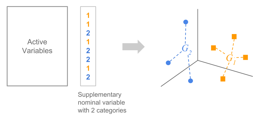
Figure 2.12: Partition of individuals based on a nominal variable
The projection of a supplementary categorical variable is the projection of the centroids onto the space of row-points. We obtain as many projected points as categories of the nominal variable.
In our working example, we use the variable region as the supplementary categorical variable. In this case we obtain the following representation in the first factorial plane (see figure 2.13). Each category groups the cities of a given region of the world.
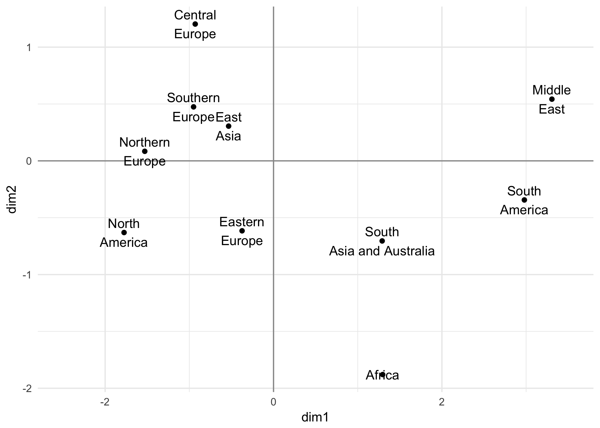
Figure 2.13: Regions of the world as supplementary categories (second PCA analysis)
This plot provides a simplified visualization of the cloud of row-points according to the chosen supplementary categorical variable—in this case region. The configuration of the category-points allows us to assess certain areas of the graph. This could suggest some elements useful in the interpretation of the factorial directions. For example, the opposition of Europe and North America against the rest of the world regions.
Supplementary Category and Supplementary Individual
In summary, a supplementary category is positioned as the average point (i.e. centroid) of the individuals that form such category. Consequently, the definition of a nominal variable with three categories is equivalent to defining three supplementary individuals equal to the center of gravity of the active variables for each category. The supplementary individuals are located in the same factorial plane as the active individuals, with the same rules of interpretation.
2.4.3 Profiling with V-test
The projection of a category is interpreted as the position of the average individual of the group defined by such category—the centroid. This position can be close to the center of gravity of all the individuals (i.e. the origin of the factorial coordinates).
The proximity to the overall center of gravity suggests that there is little difference between the individuals that have such category and the set of all the individuals.
In contrast, when the projected category is clearly separated from the overall centroid, this indicates that there is a relationship between the active variables and the given category.
It would be interesting to assess what category (i.e group of individuals) seems to indicate an relevant area in the factorial plane.
We can regard the overall center of gravity to be the center of atraction of the average points of all groups randomly selected. By doing this, we can highlight those centroids that differ “significantly” from the overall centroid. The individuals that form such group will have a high degree of resemblance among them, and therefore will be sufficiently unique to differentiate themselves from the center of gravity.
Suppose that we randomly select a group of \(n_j\) individuals from the total of \(n\) individuals. The graph of these individuals over the first factorial plane will be a random scatter plot over this plane.
The average point of these \(n_j\) individuals will differ only by the random fluctuations from the overall average represented by the origin of the coordinates (see figure 2.14).
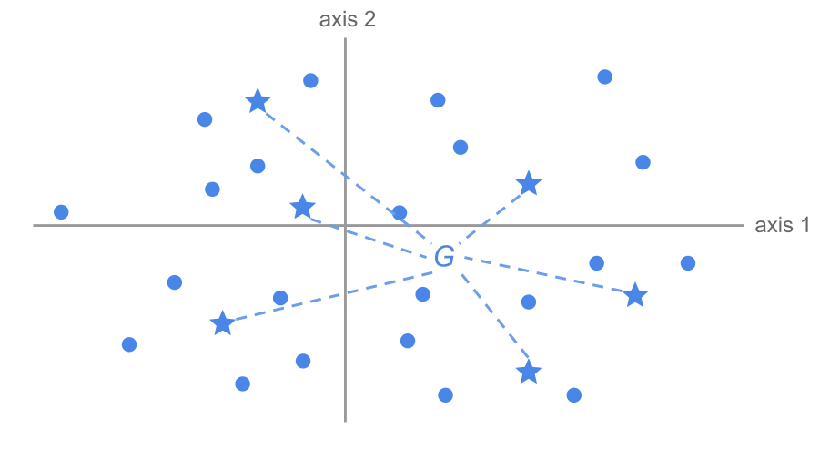
Figure 2.14: Random selection of a group of individuals
Suppose that we repeat the random selection of \(n_j\) individuals a large number of times. For each repetition we calculate the average point of the selected individuals. We should expect the center of all these groups to coincide with the overall center of gravity.
Now, suppose that a set of \(n_k\) individuals having the same category, non-randomly selected, are located in a certain region of the factorial plane (see figure 2.15).
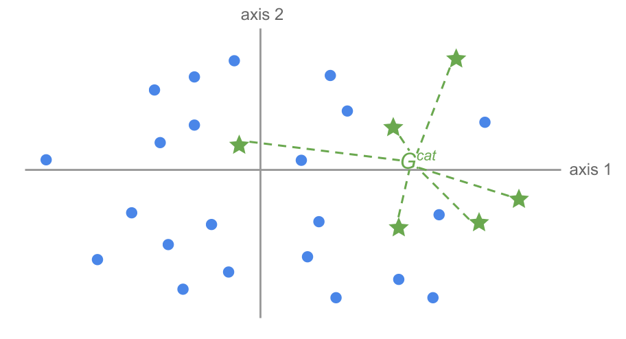
Figure 2.15: Group of individuals defined by a certain category
We can calculate the average point of these individuals. Furthermore, we can compute the distance between this average point and the overall centroid. Is the position of this average point compatible with the hypothesis that the individuals have been randomly selected? The more the evidence againts this hypothesis, the more interesting this category will be to profile the region of the factorial plane that it occupies.
Interpreting results with the v-test
The idea behind the so-called v-test involves performing a hypothesis test. The null hypothesis \(H_0\) consists in the assumption that a set of \(n_k\) individuals are randomly selected, without replacement, from the total of \(n\) individuals.
Under the null hypothesis, we calculate the probability of observing a configuration as the one obtained, or more extreme. This is the critical probability associated to \(H_0\). The smaller this probability, the less likely is the hypothesis of individuals being randomly selected.
In order to classify the elements in terms of importance, we rank them based on their critical probability. The elements that are most characteristic are those with a smaller critical probability.
The more significant is the difference between the average of the coordinates in group \(k\) and the overall centroid, the more interesting the position will be of this group in the factorial plane.
Let \(m\) be the average of the coordinates and \(s^2\) the empirical variance calculated from the \(n\) observations, which will be equal to the eigenvalue of the corresponding axis. Let \(m_k\) be the average of the \(n_k\) observations in group \(k\). We call \(M_k\) to the random variable “average of the \(k\) extractions.” Under the null hypothesis of random selection without replacement from a finite populatoin, we have that:
\[\begin{align*} E_{H_0} [M_k] &= 0 \\ Var_{H_0} [M_k] &= \frac{n - n_k}{n - 1} \times \frac{\lambda_{\alpha}}{n_k} = s^{2}_{k} \end{align*}\]
The average \(M_k\) coincides with the average of the coordinates (\(\sum_i \psi_{i\alpha} = 0\)) and its variance is equal to the variance of the coordinates of the axis \(\alpha\) (\(\lambda_{\alpha}\)) divided by the number of observations from group \(k\) and scaled by the factor \((n - n_k) / (n-1)\).
If \(n\) and \(n_k\) are not very small, the central limit theorem is applicable (even though the extractions are not independent) and in this case the variable:
\[ U = \frac{M_k - m}{s_k} \]
approximately follows a standard normal distribution.
The critical probability associated to this variable is the probability of a normal distribution of observing a value greater than \(u\) calculated on the \(n_k\) individuals for the random variable \(U\).
We obtain the most characterizing probabilities of an axis, selecting the categories with the smaller critical probabilities. This is equivalent to selecting the categories that have the larger values:
\[ u = \frac{m_k - m}{s_k} \tag{2.18} \]
The statistic \(u\) is what we call the v-test. This value expresses, in number of standard deviations, the difference between the average \(m_k\) of group \(k\), and the overall average \(m\).
We interpret this value as follows: the probability of having a difference between both averages is the probability of exceeding this number of standard deviations in a normal distribution.
What we are doing is evaluating some sort of distance between the overall average and the average of a group, measured in terms of standard deviations from a normal distribution. By standardizing these values, we have a common unit that allows us to compare different categories, and rank them according to their importance. In this way, we assess the likelihood of the null hypothesis: that individuals from category \(k\) have been randomly selected.
The larger this v-test (in absolute value), the more this indicates that the group of individuals occupies a significant position, and characterizes the region of the factorial plane where they are.
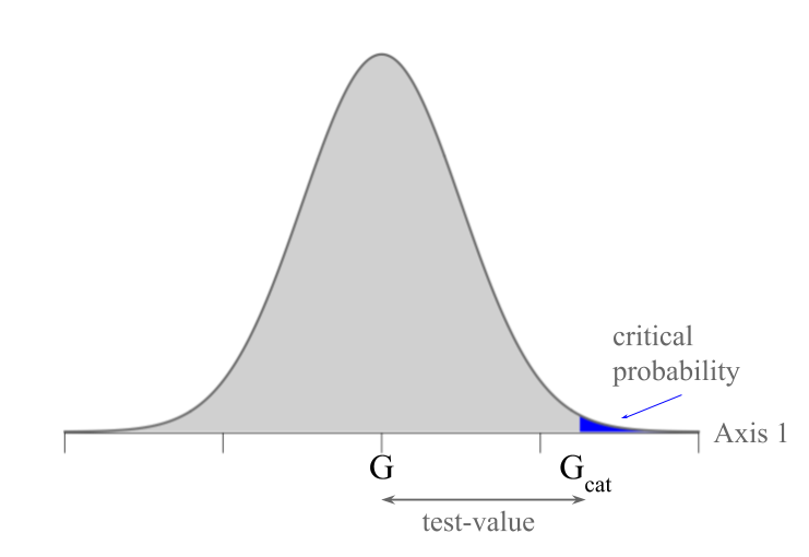
Figure 2.16: V-test associated to a critical probability
In practice, we often use the threshold of 2 standard deviations in order to determine if the variable is significant.
Values larger than 2 indicate less likely value under the null hypothesis of random selection. We can think that these individuals have some kind of relationship with the set of active variables, which makes them have an excentric position in the cloud of individuals.
However, we should take into account the total number of individuals. One could double the data table indefinitly to make the v-test as large as desired.
We must say that the v-test is used as a tool to arrange the categories according to their association with the factorial axes. We don’t really use the v-test to formally test a null hypothesis.
In our working examples of the cities, we have a nominal categorical variable: the region of the world in which a city is located. This variable allows us to obtain a simplified representation of the cloud of cities. The results obtained with the first three axes are displayed in 2.11.
| EFF | PABS | vtest1 | vtest2 | vtest3 | |
|---|---|---|---|---|---|
| Northern Europe | 6 | 6 | -1.9 | -0.2 | 1.3 |
| Central Europe | 9 | 9 | -1.4 | -3.0 | -0.9 |
| Southern Europe | 5 | 5 | -1.0 | -0.8 | 0.7 |
| Africa | 3 | 3 | 1.1 | 2.5 | 0.7 |
| East Asia | 5 | 5 | -0.6 | -0.5 | -1.4 |
| South Asia and Australia | 5 | 5 | 1.4 | 1.3 | -1.7 |
| North America | 7 | 7 | -2.4 | 1.4 | -0.2 |
| South America | 6 | 6 | 3.6 | 0.7 | 1.9 |
| Middle East | 3 | 3 | 2.8 | -0.7 | -0.5 |
| Eastern Europe | 2 | 2 | -0.3 | 0.7 | 0.5 |
The first column, named EFF, provides the effective of each category (total number of cities of each category). The second column, named PABS provides the weight (sum of the weights of all the cities in a given category). When we have uniform weights, the weight and the effective are the same. The first category is formed by six cities of Northern Europe.
The v-test controlled, for each axis, the hypothesis of random distribution for these 6 cities among the 51 cities. In the first axis, for example, we see a significant opposition of North America with respect to South America and Middle East, the latter being the most unequal regions of the world, whereas Central Europe corresponds to where the service professions are (relatively) better paid.
The second axis separates with significant v-tests the cities of Central Europe with the cities in Africa.
2.4.4 Axes Characterization using Continuous Variables
We’ve seen that on each axis we have the projection of the active continuous variables, of the supplementary continuous variables, of the individuals, as well as the categories of supplementary qualitative variables.
In order to interpret the axes we should pay attention to the projected elements in their extremes. A first quick approximation to characterize the axes involves listing the projected elements on their more extreme positions (with coordinates further from the origin). To sort the categories we can use the larger v-tests on each axis.
With our working example about the international cities, the continuous variables—both active and supplementary—are arranged based on their correlation displayed in table 2.12.
| scale | type | coord | weight | mean | stdev | number | |
|---|---|---|---|---|---|---|---|
| construction_worker2 | continuous | active | -0.81 | 51 | 0.72 | 0.27 | 1 |
| engineer2 | continuous | active | 0.79 | 51 | 2.12 | 0.75 | 12 |
| construction_worker | continuous | supplementary | -0.69 | 51 | 10343.14 | 8239.82 | 1 |
| tax_pct_gross_salary | continuous | supplementary | -0.68 | 51 | 20.04 | 9.54 | 2 |
| gross_buying_power | continuous | supplementary | -0.67 | 51 | 56.53 | 31.89 | 3 |
| textile_worker | continuous | supplementary | -0.63 | 51 | 9247.06 | 6429.78 | 4 |
| work_hours_year | continuous | supplementary | 0.46 | 51 | 1920.25 | 158.69 | 43 |
| Axis1 | continuous | supplementary | 0.48 | 51 | 0.00 | 3.18 | 44 |
| Axis2 | continuous | supplementary | 0.72 | 51 | 0.00 | 0.93 | 45 |
| salary_inequality | continuous | supplementary | 0.88 | 51 | 2.23 | 1.42 | 56 |
We can easily identify the variables that are more correlated with the first axis. The second axis opposes the mechanic with the rest of the professions, especially teacher (see table 2.13).
| scale | type | coord | weight | mean | stdev | number | |
|---|---|---|---|---|---|---|---|
| teacher2 | continuous | active | -0.69 | 51 | 1.19 | 0.37 | 1 |
| mechanic2 | continuous | active | 0.72 | 51 | 0.96 | 0.24 | 12 |
| bank_clerk2 | continuous | supplementary | -0.54 | 51 | 18749.02 | 13413.83 | 1 |
| factory_manager | continuous | supplementary | -0.52 | 51 | 30933.34 | 21250.57 | 2 |
| engineer | continuous | supplementary | -0.51 | 51 | 24664.71 | 14019.08 | 3 |
| teacher | continuous | supplementary | -0.50 | 51 | 16801.96 | 13243.42 | 4 |
| burger_work_time | continuous | supplementary | 0.33 | 51 | 66.71 | 97.82 | 42 |
| Axis3 | continuous | supplementary | 0.37 | 51 | 0.00 | 0.57 | 44 |
| Axis1 | continuous | supplementary | 0.43 | 51 | 0.00 | 3.18 | 45 |
| manual_qualified | continuous | supplementary | 0.68 | 51 | 1.06 | 0.17 | 46 |
2.4.5 V-test and Data Science
The v-test values are a quick and fast tool for data science (e.g. automatic exploration of significant associations) for the raw data, as well as for the results from dimension reduction techniques (e.g. PCA) and cluster analysis. When dealing with large data tables, to read complex multidimensional analysis, sorting the elements according to the v-test in decreasing order, will allow us to highlight the relevant features. This enables us to see where are the systemic patterns, which in turn will accumulate progressive knowledge about the data under analyisis.
All the available information in a data table can be ordered according to the v-tests over a fatorial plane. For example, when analyzing survey data, we could include information such as “hour of the interview”, or the interaction between sex-age of the pair interviewer-interviewee, etc. These attributes, located on the factorial planes, and associated with their most significant v-test, form an interesting validation tool of the survey results.
Figure 2.17 shows the position of the time of interview and the age of interviewer. The “interview in the afternoon”, for instance, is the center of gravity of all the interviewed persons in the afternoon.
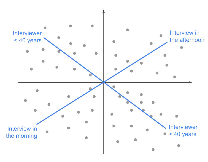
Figure 2.17: Position of additional information.
The v-test allows us to characterize all the significant associations, although we don’t take into account the redundancies nor the dependencies between elements. This fact causes multiple redundancies, and consequently, improves our knowledge about the analyzed data.
As another example, we can consider the trajectory, on a factorial plane, of the categories of age of interviewer, from 1 to 4. Let’s suppose that these categories follow the direction of the first factorial axis, as shown in figure 2.18. The form of this trajectory comes from the set of associations between the active elements in the analysis.
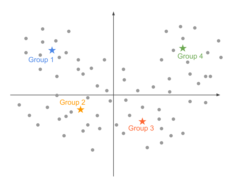
Figure 2.18: Pattern of a trajectory.
It is possible that the v-test associated to the extreme categories 1 and 4 are high. However, the central categories 2 and 3 will very likely have small v-test values that won’t be significantly different from the origin. Does this mean that we should ignore these “non significant” categories, even though their alignment on the trajetory shows a coherent pattern?
We see that the notion of a “coherent pattern” is implied in the associations among variables. Some elements may have weak v-test values, but these does not imply that they are useless.
Note
The proximity between two categories A and B from two different variables, can be the result from two distinct effects. On one hand, it is possible that both categories share most of the individuals in common, which results in the proximity between their average points. On the other hand, it is possible that the individuals the form each category are different, although they are located in the same region of the plane (see 2.19). In both cases, the proximity between categories A and B can be interpreted in terms of the similarity with respect to the active variables among the individuals forming such categories.
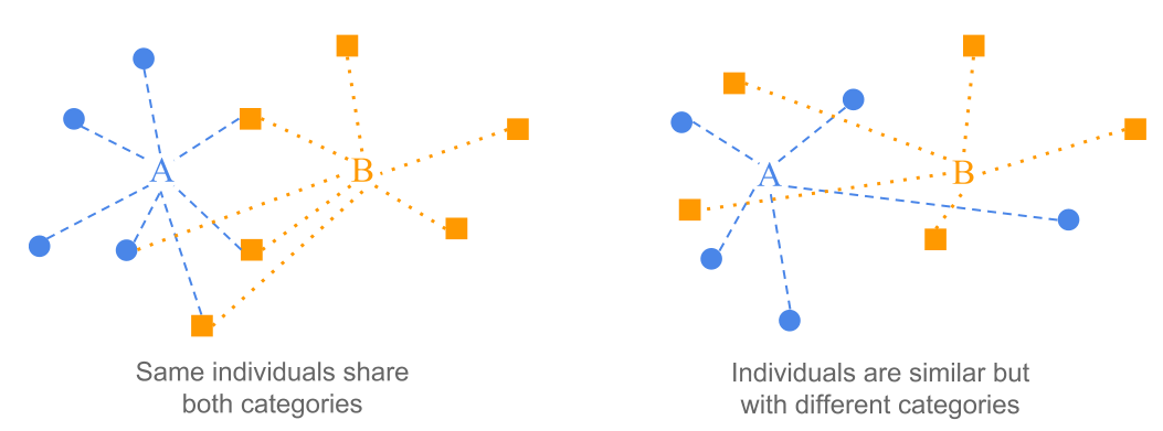
Figure 2.19: Proximity between two categories.
For example, two age categories may be close to each other, although they are formed by different individuals. Likewise, the individuals that have a certain voting behavior will be in the same region of the plane as those individuals that consume a certain product; this can be explained because they have the socio-cultural profile without being the same individuals.